Within both our music video and album art work, we heavily conform to many of the music genres expectations, whilst subverting to the wider industries expectations of content to be included within a digi-pak and a music video.
We chose our track Firehorse-'Bloodstream' because of its high recording quality, good changing dynamics, and it's song length. As the song itself is so alternative to mainstream music, it involved me researching into the hybrid genre indie-electro to define what it was, and what its conventions were as it was a genre I knew little about. By completing this research, it gave myself and Joe a broader range of ideas as to what our indie-electro audience would expect to see from our music video, and how we could conform or subvert to aspects of the genre. By conducting this research, it revealed that many of the conventions of the indie-electro genre, contradict the expected features and conventions of mainstream music videos.
One of Goodwin's conventions of music video's, is that there is a strong relationship between lyrics and visuals. After studying the lyrics, we decided that it would not be suitable to link the lyrics directly with the visuals, as the song was in fact about an addictive drug, and that we would instead take an aspect of desire within the lyrics from the line 'Don't leave me' and base our music video around the single line. Using a loosely related narrative to base our music video on is a common convention of the indie-electro genre, but did subvert what Goodwin outlined to be an expected convention of music videos. It was by researching the genre that I found that there is often a tenuous link between the lyrics and the visuals within the indie-electro genre. For example, Of Monsters and Men-'Little talks' is a rather abstract video, which does not have a strong link between lyrics and visuals, but instead is based around the singular line 'This ship will carry our bodies safe to shore.'
However, often a more common theme within the electro-indie genre within music videos is to take a multitude of ideas from the lyrics and strings them together to create an impressionist narrative, used in video's such as Poni-Hoax-'Anti-bodies' Or The Yeah Yeah Yeahs-' Skeletons' both of which I have analysed previously as part of my research as examples of narrative structures within the broad electro-indie genre. Again, we decided that we would not conform to this popular convention, and that we would instead take the idea of using a strong linear narrative concept which was extracted from the lyrics to base our music video on.
Our music video does also not include any performance element, again does not conform to another convention outlined by Goodwin, which is that music videos will often include close ups of the artist. However we chose not to, as by using two unknown characters, it puts the focus solely onto the narrative and is typical of the indie-electro genre.
Romance is a typical theme which occurs within music videos, and so by choosing to base our music video on the topic, we were conforming to a popular convention of mainstream music videos. However, we did also challenge the expected romantic narrative, by twisting the plot towards the end of the music video, and ending it with a dramatic break up. However, again it is common within the indie-electro genre to portray controversial views about issues such as modern day relationships and romance within their music videos, an example of this being The Yeah Yeah Yeahs-'Sacrilege' which explores a controversial topic of promiscuity rather than simply repeating the too commonly exploited fairy tale.
During the initial stages of story boarding, we were going to simply conform to the mainstream genre conventions and simply tell the tale of two strangers falling in love, and attempt to make it alternative by using different shots of the body as opposed to faces to tell the story. But upon further consideration, we decided that the story may be spread too thin, and that a twist and plot change would suit not only the tone of the song better, but would also better conform to our music genre's conventions. We chose to do this as we thought it would make our story more relateable to our audience, and therefore engage them, an important factor to consider when making a music video. However, we had to make our characters relatable without exposing their faces, and therefore had to carefully construct the mise-en-scene to include every day items, scenarios, and locations.
We did heavily conform to the expected location settings for our genre, by using busy city urban locations for our music video, which during my research stages, revealed was a heavily conformed to genre convention due to the popularity of the electronic music genre in cities. It therefore would be where the majority of our target audience were situated, and a setting that they could again relate to. The urban city location was important for our narrative as it made the possibility of romance seem less likely within such a fast paced impersonal environment and therefore when romance does occur, it almost makes the situation seem rare so that the audience are disheartened when the couple break up.
 |
Our opening city location shot

The shot of the couple walking by a city river within the video

The couple sitting on a public park bench, similar to the indie film 500 days of summer
(as shown below)

In addition as to conforming to the type of locations we would set our music video in, we also conformed to the amount of locations that we shot in, with few varying locations being used, with many being repetitively used to help show the contrast in the relationship at the start and at the end of the relationship. For example within the Postal service 'A tattered piece of string' which is a song within the same genre as our own, a single location of a public city launderette is used throughout the entire music video, as it does not rely on new exciting locations and imagery to grip its audience, but instead relies on an interesting narrative, similar to our own music video.
The representation of of both of our characters within our music video is challenging to the typical representations as expected within the wider industry, but again, it is not an uncommon representation within our unique genre. For example, our music video is not shot with the 'male gaze' in mind as Laura Mulvey identifies as a common and recurring feature within many music videos, as our female protagonist is not viewed vouyeristically, a feature of which Goodwin also identifies as a common feature of music videos. Instead, she is portrayed as independent and powerful within the relationship which is as mentioned, a common feature of the indie-electro genre.

Holly is the most powerful character throughout the music video, most of the shots are focused on her and her actions, and we reveal her to be the dominating character who is in control. As the screen shot reveals, Holly is the main character who initiates the romance with her confident attitude, and is clearly comfortable and able to

lure men in at her disposal. As the relationship progresses and the romance appears to rapidly fade, she is the one who takes control, by ignoring Joe's phone call, and as the last screen shot reveals, she is the one who makes the decision to end the relationship, and pushes him out of the door. However, we do not entirely ignore Holly's

femininity, and in fact use this to her advantage to take control, a growing representation of women, used by iconic female music artists such as Beyonce who promote the idea of women using their natural femininity to empower themselves and subordinate men. However, an artist within our genre who demonstrates this well is Bat For Lashes within their music video 'A Wall' whereby the female artist dances and controls the man at almost all times, and the man seems powerless and feeble in comparison to the woman.
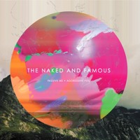
A further example of a portrayal of powerful women within our genre is seen within the music video by The Naked And Famous-'No Way' which shows the growing battle for women between wanting to be powerful, and yet trapped by the idyllic image of a woman which they feel they are expected to live up to. This is an issue which is beginning to arise and become more popular throughout the media, and especially within our genre. However, although it an increasing common portrayal of women, the portrayal of women as voyeuristic or as the 'damsel in distress' is style a dominant portrayal throughout the media and within our genre, an example being Owl City, Metropolis whereby the girl is 'saved' by the boy, and she is a powerless victim and bystander throughout.
Within our music video, we show Holly's femininity through both her mannerisms and her clothing, which are not at all voyeuristic, but are boldly flirtatious.
 Print screens from our music video are examples of Holly's flirtatious manner, which are typically used across the media to signify feminine attraction.
The early close up shots of Holly reveal her femininity subtly through her clothing, for example in the opening shot, she is wearing a pair of frilled mint green socks, of which connote a female who is concerned with her delicate image. We then reveal her feminine leggings and jewelry items of which again make it clear to the audience, that she is a woman, without needing to reveal further aspects of her body or indeed her face. However, as the music video progresses their becomes a more frequent use of long shots, which expose Holly's clothing which are a mix of bricolage style, with clothing items typically associated with men, being used to create her own unique style and image, such as the 1970's style male bomber jacket, which we paired with a feminine white short blouse and leggings. We took great care in constructing our characters costume, as theorist Dick Hebdige states, that style can be read by others almost as a language, and is used to construct the identity of our character. This is especially important within our music video, as their is no dialogue to gather information about the character, but instead the audience read into the style and self expression of the character and extract elements of information to withdraw conclusions about her. Therefore by choosing slightly unique clothing, we were able to portray our character as the 'Manic Pixie Dream Girl' as I have previously written about, which is a typical convention to the indie genre. By establishing our character as an unique individual, it made it easy to establish our character Joe, as contrastingly ordinary, by dressing him in simple mainstream fashion clothing.
The props that we used were also conforming to the expected convention of our genre, by using vintage style props such as the bike in which we see Holly on at the start of the video, which is a common prop in electro-indie music videos. This is because it symbolises an adults child like innocence and freedom, and their desire to live at their own pace rather than to again simply follow mainstream society.
Indie/Electro examples which include vintage bikes:
|

However, it is also a common prop used across the wider music industry, such as in pop videos by artist such as Rihanna in her 'We Found Love' music video, as the use of a bike represents a sense of lack of cares and sense of freedom which is often expressed vocally as they sing the lyrics whilst on the bike.
We have also included props that we felt would make our narrative more relatable to our audience, as our target audience are older teenagers and young adults, as they are the key demographic who listen to our genre of music. They are therefore likely to have a good knowledge of new technologies, and it is likely to have a large impact on their lives, which is why we included scenes with Xbox's, mobile phones and Televisions, to focus on the realities of modern day deterioration of relationships. Making our video more relatable to our audience again as previously mentioned, conforms to Lacan's theory of the audience identifying with the media product.
During the editing process, we did deliberately attempt to conform to a genre convention as outline by Goodwin that both myself and Joe felt was really important within our music video, which was that their should be a link between the music and visuals. This affected how we both plotted our narrative, and edited it. For example we chose scenes which we thought suited the tone for the song, and used the drastic change in instruments during the middle of the song to signify the change in events between the couple which switched between hopeful, to miserable in a matter of a few seconds. As well as changing the tone of the scene to suit the tone of the music, we also ensured that we cut to the beat as it helps anchor the video to the track and make the two which initially seem contrasting, seem synchronized. This is a convention that is used in almost every music video created, and one which we therefore felt was necessary and to stick to.
Our editing style nevertheless, was very particular to our genre, as my research had strongly conformed that hard cuts to the beat were used throughout the majority of indie-electro music videos to emphasize the beat of the music of which the genre is heavily focused around, meaning we were again conforming to our genre conventions.
Our narrative is a simple linear narrative, as opposed to many within the genre such as the music video by The Yeah Yeah Yeahs-'Sacrilege' which is a non-linear narrative and includes flash backs and flash forwards to create the feeling of disorientation for its audience, to make the audience attempt to deconstruct the intended meaning of the text. However this would not have been an appropriate method for us to have used in as we were trying to make our narrative clear to our audience, and we wanted to end our music video in a way in which perhaps our audience were not expecting, and therefore we needed to keep the events in a linear order to maintain the sense of enigma.
How I have used and challenged forms and conventions of real media products within my digipak?
My CD design almost entirely conforms to both the indie-electro music genre, and the wider music industry. For example, the composition of my CD cover conforms to the expected conventions of a CD cover, as my title is positioned at the top centre with a simple image at the centre of the panel like the indie-electro examples shown below.
My CD cover:


The font I have used is also typical to my genre and enormously similar to the title of the first example above. The capital letters in bold white typo in small font makes a bold statement about the artist and their music, which is that their music is fresh, genuine, and sincere and by using capital letters, it connotes that they as artists are estbalished and have made a name of themselves. However, by using a fairly small size font, it does perhaps suggest that they do not need to necessarily grab the audience's attention to buy the CD, but that instead their fan base is already firmly established and in existence and will find the artists album, without a hard sell as the music will sell itself. This is a bold genre convention which is particularly prevalent to the indie-electro genre, and a convention of which I have conformed to.The fairly simple font which I choose also reiterates the previous statement that the artist want to appear focused on the music rather than perhaps establishing themselves with an elaborate logo and type face.
It is uncommon both within the indie-electro genre and the wider music industry for much text to appear on a CD, as the image is almost entirely the main focus, which is why the chosen image has to both reflect the genre, and the band themselves and is therefore regarded as significant. I have conformed to this convention of using a minimal amount of text to allow the images to be the main focus of the album, only using it to display the bands name and album on the front cover, and the track titles on the back panel, which is expected by the audience, as they want to be informed what songs are on the album. The only other feature visible on the back of my album is a bar code, which was simply required as a necessary item to have on my CD, as it is designed to be sold in shops. However I personalised the bar code for aesthetic reasons, to appear more subtle as I did not want it to withdraw the focus from imagery of my back panel and so I inverted the colours to make it plain white, and placed it in the bottom corner where it would remain reasonably unnoticed.
As the examples above show, within the indie-electro genre, the artist very rarely feature within the album artwork, which again shows that the focus is on the music rather than the artists image. I have used this concept within my design as I felt it was important to not only conform to this convention, but conform to the convention of recognising an active audience when making my media products, as I have an enigmatic image which enables the audience as individuals to personally de-construct the alternative impressionist image. This both engages and acknowledges my audience within the creative process.
For my inside panels, I have created a single long panoramic image which will stretch across all three panels to again make the album appear simple and minimalist, a common convention within the music genre. The shot I have used as the inside panels is one which appears quite basic, again to emphasise the minimalist and simplistic design, which I have purposely created by removing objects such as the tree within the editing process which I felt subtracted from the simplistic feel.

The album poster again follows the key expected conventions of a magazine advertisement, as it includes reviews and ratings which I think will appeal to my audience and persuade others to buy the album. Music critics reviews are important on a magazine music advert as audiences often rely on well respected critics from established music magazines to recommend audiences new material, and by showing the track in a positive light by displaying 4 and 5 star ratings, it is encouraging audiences who may not have heard of the band to find out more.


As the example above demonstrates, the composition is also similar to my own album, with my bands name at the top of the page, a release date near the bottom, and a central image with reviews and ratings as such features are regarded as key expected items to have on an album advertisement, as the image is again used to leave the audience with a general impression of the band and their music, and a release date is required to build anticipation and a 'buzz' about an albums release, or inform the audience that it is immediately available and where it can be purchased.
No comments:
Post a Comment